Responsive design for mobile users is crucial today.
In October of 2015, Google revealed that internet searches on mobile devices with screens 6 inches or less in size now outnumber searches on all other platforms. Is your website mobile friendly?
Even if your site passes Google’s Mobile Friendly Test, it still may not be optimized for smartphone users. Your web designer may have adjusted the site’s design to pass Google’s test, but what your visitors experience may be sending them back to search results.
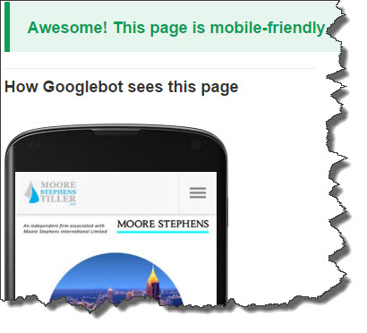
Just enter your URL, and Google’s Mobile-Friendly Test will analyze your website.
Try these steps to help you finish the job and boost conversion:
Check your site as a visitor.
Use your smartphone to navigate to your small business website. Put yourself in the position of a potential client or customer. How does it look? Can you navigate easily? Is information immediately available? Can you make contact immediately? Would you convert? Don’t stop with the home page. Visit every page on the site and take notes.
Eliminate walls of words.
Text content that looks great on a large display may be impenetrable on a smart phone screen. Long paragraphs can take up most of the screen with few breaks. For best results on mobile devices, use the strategy newspapers use for narrow columns: Break paragraphs up to make them shorter. They’ll still look fine on large displays.
 Use short mobile headings.
Headings that break into two lines on a narrow screen lose impact. Trim them down to one line when the phone is held vertically. Check all bullet points, too. Brevity increases user attention and gives content more punch. Aim for a clean, tidy appearance for all text content, and you’ll keep visitors on your pages.
Avoid fixed-size content elements.
Mobile device browsers do their best to scale fonts, graphics, tables, and other content to fit smaller displays, but there are serious limits. Complex graphic images may lose relevance when reduced in size. Tables often become unreadable when scaled down. PDF pages, like restaurant menus, may not display at all or may require scrolling sideways.
Move conversion features up.
Mobile device users hate to scroll. If calls-to-action and contact links are at the bottom of your web pages, they may never be seen. Rewrite content to present value propositions and ways to convert near the top of the page. Make your case early and you’ll increase your conversion rate. Conversion optimization is everything.
Prioritizing Mobile Content Gives You a Distinct Advantage
The tipping point has already arrived. With a rising percentage of potential customers visiting you on tiny smartphone displays, investing in improvements to their visitor experience pays big dividends. If you don’t get mobile users’ attention, your competitors will.